
The Psychology of Color in Marketing: How to Choose a Brand Palette
In today’s visually saturated marketplace, the psychology of color in marketing plays a pivotal role in shaping consumer perceptions and driving brand loyalty. Colors aren’t just aesthetic choices; they evoke emotions, influence decisions, and can make or break a brand’s identity. Studies show that color improves brand recognition by up to 80%, highlighting why selecting the right brand palette is crucial for marketers. This article delves into the science of color psychology, explores how specific hues impact behavior, and provides actionable steps for choosing an effective brand color scheme.
The Science Behind Color Psychology
Feature Video
Color psychology in marketing is rooted in how the human brain processes visual stimuli. When we see a color, our eyes send signals to the brain’s limbic system, which governs emotions and memories. This rapid response—often within 90 seconds of initial viewing—means colors can sway purchasing decisions subconsciously. Research from the University of Loyola found that colors influence 85% of shopping choices, underscoring their power in branding.
Neurologically, warm colors like red and orange stimulate the sympathetic nervous system, triggering excitement or urgency, while cool tones like blue and green activate the parasympathetic system, promoting calm. Marketers leverage this by aligning colors with desired emotional responses. For instance, fast-food chains often use red and yellow to whet appetites and accelerate turnover.
Cultural contexts also shape color psychology. In Western cultures, white symbolizes purity, but in some Eastern traditions, it represents mourning. Global brands must consider these nuances when crafting a universal brand palette.
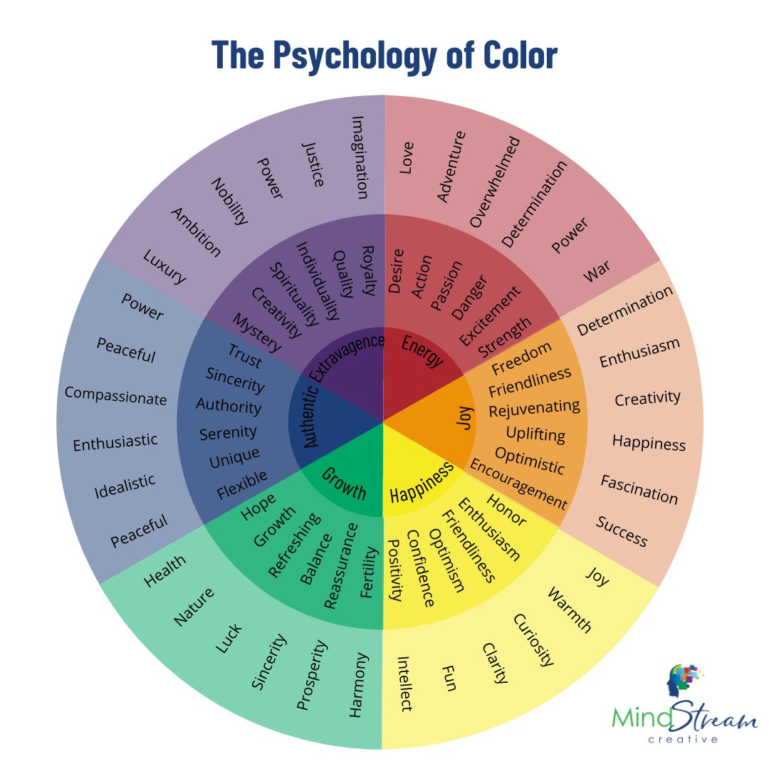
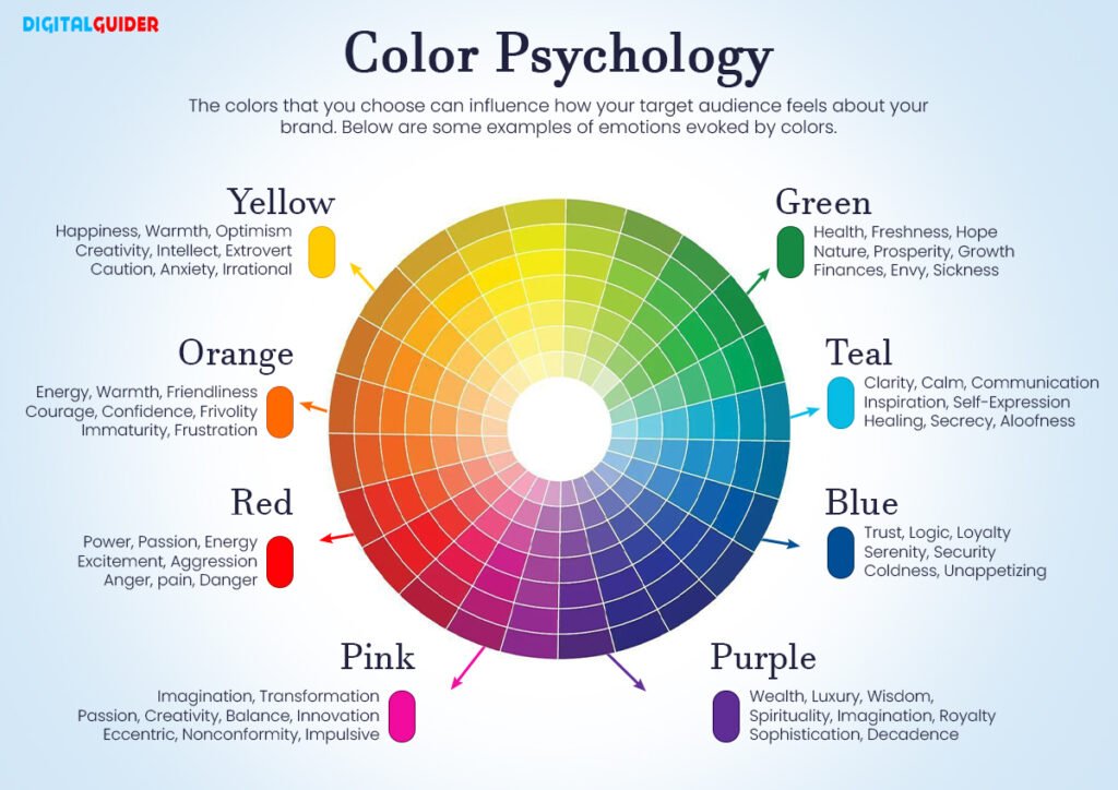
Understanding Color Meanings and Emotions

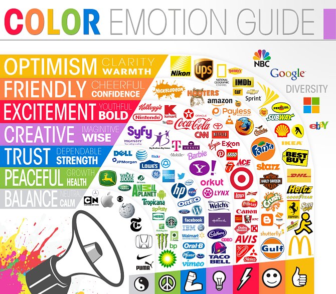
Each color carries distinct psychological associations, making informed selection key to a resonant brand palette. Red conveys passion, energy, and urgency—ideal for clearance sales or impulse buys, as seen with Coca-Cola’s iconic red. It increases heart rates and grabs attention, boosting click-through rates by 21% in digital ads according to HubSpot.
Blue evokes trust, professionalism, and serenity, dominating finance and tech sectors. Facebook and IBM’s blues foster reliability, with studies showing blue enhances productivity and calms viewers. Green signifies growth, health, and eco-friendliness, perfect for organic brands like Whole Foods, signaling freshness and sustainability.
Yellow sparks optimism and creativity but can overwhelm if overused—think McDonald’s golden arches for cheerfulness. Purple blends luxury and mystery, appealing to premium beauty brands like Cadbury. Orange combines red’s energy with yellow’s fun, energizing calls-to-action. Black exudes sophistication and power, while white offers simplicity and cleanliness.
These meanings aren’t absolute; context matters. Pairing complementary colors amplifies impact, creating a cohesive brand palette that reinforces messaging.
How Colors Influence Consumer Behavior
The psychology of color in marketing directly affects consumer behavior across touchpoints. In e-commerce, product images with brand-aligned colors see 20% higher conversion rates. Packaging studies reveal that inconsistent colors lead to 30% lower recall.
Colors also segment audiences. Younger demographics respond to vibrant neons for playfulness, while professionals prefer muted earth tones for approachability. Gender plays a role too—women often favor softer pastels, men bolder primaries, per Kissmetrics research.
Seasonal trends influence palettes: earthy tones for fall campaigns evoke harvest warmth, pastels for spring freshness. A/B testing colors on websites can reveal preferences, with tools like Google Optimize showing blue buttons outperforming red for trust-based conversions.
Choosing the Right Colors for Your Brand

Selecting a brand palette starts with defining your brand’s personality. Ask: What emotions do you want to evoke? Who is your target audience? What industry norms exist?
Step 1: Identify core values. Eco-brands opt for greens and browns; luxury for golds and blacks. Analyze competitors—stand out without clashing.
Step 2: Consider audience demographics. For B2B tech, navy blue builds credibility; for Gen Z fashion, bold pinks signal trendiness.
Step 3: Factor in industry standards. Healthcare leans blue-green for healing; food uses appetizing reds-oranges. Break conventions strategically for differentiation, like Tiffany’s signature teal.
Step 4: Test accessibility. Ensure high contrast for readability—WCAG guidelines recommend 4.5:1 ratios. Tools like Adobe Color check this.
Ultimately, your palette should align with brand story, ensuring consistency across logos, websites, ads, and packaging.
Creating a Balanced Brand Palette
A strong brand palette typically includes 3-5 colors: one primary (60% usage), secondary (30%), and accents (10%). The 60-30-10 rule maintains harmony.
Primary colors define identity—think Starbucks’ green. Secondaries support, providing variety without dilution. Accents add pop for CTAs or highlights.
Use color theory: analogous schemes (adjacent hues like blue-green) for harmony; complementary (opposites like blue-orange) for contrast. Triadic palettes (evenly spaced, e.g., red-yellow-blue) offer vibrancy.
Monetize with tools like Coolors or Canva’s generator, inputting a base color for suggestions. Lock in hex codes, RGB, and CMYK values for print-digital consistency. Evolve palettes gradually to avoid alienating loyal customers.
Real-World Case Studies
Coca-Cola’s red palette taps urgency and joy, contributing to its 94% global recognition. Shifting to silver in the 1990s New Coke fiasco tanked sales, proving palette loyalty.
Spotify’s duotone black-green creates modern coolness, enhancing user engagement. Burberry’s beige-check palette screams heritage luxury, while its recent navy refresh appeals to millennials.
These examples illustrate how psychology of color in marketing, when mastered, yields measurable ROI—up to 40% sales lifts per color optimization studies.
Common Mistakes to Avoid

Pitfalls abound in palette selection. Trend-chasing leads to frequent rebrands, eroding equity. Overloading with too many colors confuses viewers—stick to limits.
Ignoring cultural sensitivities can backfire; green means “go” in the West but death in Indonesia. Neglecting digital performance—neons wash out on mobiles—harms usability.
Finally, skipping testing: Always survey audiences and A/B test. Data trumps intuition in color psychology.
Tools and Tips for Selecting Your Palette

Streamline with free tools: Adobe Color Wheel for harmony rules; Paletton for advanced schemes; Coolors for quick generation. Extract from images via ColorSnap.
Tips: Start with mood boards. Use Pantone’s Color of the Year for inspiration. Ensure versatility across mediums. Refresh every 3-5 years subtly.
Professional designers employ Figma or Sketch for mockups, validating palettes pre-launch.
In conclusion, mastering the psychology of color in marketing empowers brands to forge emotional connections, boost recognition, and drive conversions. By thoughtfully choosing a brand palette—grounded in science, audience insights, and testing—you position your brand for lasting impact. Experiment boldly, measure rigorously, and watch your marketing transform.
(Word count: 1217)