
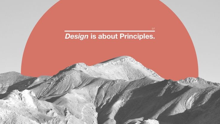
A Beginner’s Guide to Graphic Design Principles
A Beginner’s Guide to Graphic Design Principles
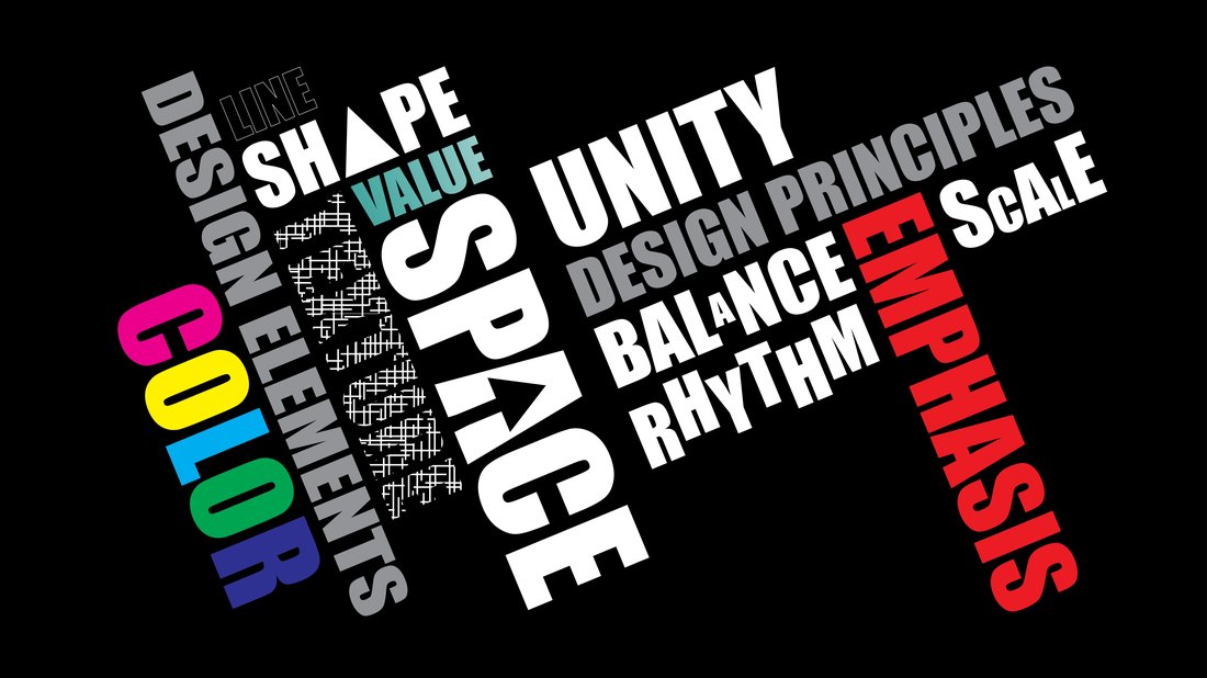
Graphic design is an essential skill in today’s digital world, powering everything from social media graphics to branding materials and websites. For beginners, understanding graphic design principles is the foundation of creating visually appealing and effective designs. These timeless rules help designers communicate ideas clearly, evoke emotions, and guide the viewer’s eye effortlessly. Whether you’re designing a logo, poster, or infographic, mastering these principles will elevate your work from amateur to professional.
In this beginner’s guide to graphic design principles, we’ll break down the core concepts like balance, contrast, alignment, and more. Optimized for SEO with keywords such as “graphic design principles for beginners,” “basic graphic design rules,” and “essential design principles,” this article will equip you with actionable tips. By the end, you’ll have a solid framework to start your design journey using tools like Adobe Illustrator, Canva, or Figma.
Understanding Balance in Graphic Design
Feature Video
Balance is one of the most fundamental graphic design principles. It refers to the distribution of visual weight in a composition, ensuring no single element overwhelms the others. Imagine a seesaw: if one side is heavier, it tips. Similarly, unbalanced designs feel chaotic and unstable.
There are three types of balance: symmetrical, asymmetrical, and radial. Symmetrical balance mirrors elements on either side of a central axis, creating a formal, stable look ideal for logos or invitations. Asymmetrical balance uses different elements of varying sizes, colors, or textures to achieve equilibrium—think of a large bold headline balanced by smaller text and images. Radial balance emanates from a central point, like a mandala or pie chart.
For beginners, start with symmetrical balance to build confidence. Practice by drawing a vertical line down your canvas and mirroring elements. Tools like Photoshop’s symmetry tool can help. Poor balance distracts viewers, so always step back and assess: Does it feel harmonious? Applying balance ensures your designs are visually comfortable and professional, a key graphic design principle for beginners.
Contrast: The Key to Visual Hierarchy
Contrast creates visual interest by juxtaposing differing elements, such as light vs. dark, large vs. small, or thick vs. thin lines. It’s a powerhouse among basic graphic design rules, making designs pop and guiding attention.
Without contrast, designs become monotonous and hard to read. For instance, pairing black text on a white background provides high contrast for readability. Color contrast follows the same logic—complementary colors like blue and orange vibrate against each other. Size contrast emphasizes headlines over body text, while shape contrast mixes circles with squares.
SEO tip: High-contrast designs improve user experience on websites, boosting dwell time. Beginners can experiment in Canva by selecting opposing colors from the palette. Overuse contrast sparingly to avoid clutter; aim for 60-30-10 rule (60% dominant color, 30% secondary, 10% accent). Mastering contrast transforms flat designs into dynamic ones.
Emphasis and Hierarchy in Design
Emphasis highlights the most important element, while hierarchy organizes information by importance. Together, they form a crucial duo in graphic design principles for beginners. Hierarchy uses size, color, and placement to lead the eye from primary to secondary content.
Think of a poster: The event title (largest, boldest) gets emphasis, followed by date and venue. Techniques include focal points via bright colors or whitespace around key elements. Gestalt theory supports this—our brains seek patterns and prioritize prominent items.
To apply: Sketch thumbnails prioritizing content. Use font weights (bold for headers) and scale images accordingly. In web design, F-pattern reading (top-left to bottom-right) informs hierarchy. Effective hierarchy ensures viewers grasp your message in seconds, vital for marketing materials.
Alignment: Creating Order and Professionalism

Alignment positions elements so they visually connect, fostering unity and polish. Misaligned designs scream amateurism; aligned ones look intentional and clean. A core graphic design principle, it uses grids invisible to viewers but essential for structure.
Left or right alignment suits text-heavy designs; center for symmetry. Edge and center alignment prevent “trapped” white space. In Adobe XD or Sketch, enable grids and snap-to guides. For responsive web, fluid grids adapt to screens.
Beginners’ exercise: Redesign a messy flyer using a 12-column grid. Proper alignment enhances readability by 20-30%, per UX studies, making it an SEO-friendly practice for digital assets.
Repetition for Consistency and Branding

Repetition reinforces elements like colors, fonts, or shapes, creating rhythm and brand recognition. It’s the glue binding designs in portfolios or campaigns.
Repeat bullet styles in lists or motifs in patterns. Apple’s minimalist repetition of white space and sans-serif fonts exemplifies this. Avoid overuse to prevent boredom—vary slightly for interest.
In multi-page PDFs, consistent headers build familiarity. Tools like InDesign’s stylesheets automate this. Repetition strengthens identity, a must for essential design principles.
Proximity: Grouping for Clarity

Proximity places related items close, signaling connection. It declutters by organizing info chunks, per CRAP principles (Contrast, Repetition, Alignment, Proximity).
A business card with contact details clustered reads faster than scattered ones. Adjust spacing: 1.5x line height between paragraphs. White space defines proximity zones.
For infographics, group stats visually. This principle reduces cognitive load, improving comprehension by 40%, ideal for educational content.
The Power of White Space (Negative Space)

White space is empty areas breathing life into designs. Far from wasted, it emphasizes content and prevents overwhelm.
Google’s homepage mastery uses ample white space for focus. Increase margins, padding, and line heights. In logos, negative space forms hidden shapes (e.g., FedEx arrow).
Beginners: Audit designs—add 20% more space. It conveys luxury and clarity, enhancing SEO via better mobile UX.
Color Theory Basics for Beginners

Color evokes mood: Blues trust, reds urgency. Understand hue, saturation, value. Harmonies like analogous (adjacent colors) or triadic ensure cohesion.
Use 60-30-10 rule. Tools like Coolors generate palettes. Accessibility: WCAG ratios for contrast. Color mastery captivates audiences.
Typography: The Art of Readability
Typography selects fonts conveying personality—serif for tradition, sans-serif modern. Limit to 2-3 families. Hierarchy via size (24pt headers, 16pt body), leading (1.5x font size), kerning for spacing.
Pair serif/sans-serif contrasts. Readability rules: 45-75 characters per line. Responsive fonts scale with media queries.
Putting It All Together: Practice and Tools
Integrate principles iteratively: Sketch, prototype, refine. Free tools: Canva, GIMP; pro: Adobe Suite. Study masters like Saul Bass. Join Dribbble for feedback.
Practice projects: Redesign album covers applying balance and contrast. Track progress; soon, intuitive designs emerge.
Conclusion
These graphic design principles for beginners—balance, contrast, hierarchy, alignment, repetition, proximity, white space, color, typography—form your toolkit. Consistent application yields professional results. Start small, experiment boldly, and watch skills grow. Dive in; the design world awaits!
(Word count: 1215)